Look around! Graphic design is everywhere — from the deep corners of the streets to those of the web. Whether you’re a novice artist, brand owner, or freelance graphic designer looking to brush up on your design skills, you’ve landed on the right page.
Let us be frank with you: You’re inevitably going to face a learning curve before you turn your trials into triumphs. But the good news is, once you know the fundamentals of graphic design, you’ll be perfectly capable of creating catchy, compelling graphics.
We hope you’re ready to learn 15 vital graphic design tips for beginners and non-designers that will help to amp up your brand design, website, or social media content. Let’s go!
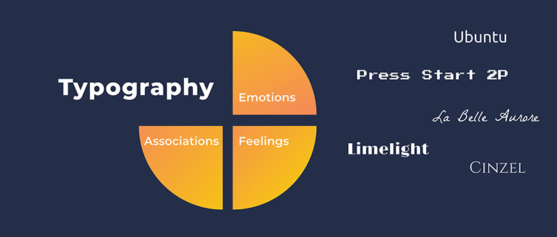
1. Treat Typography With Care
Text is one of the most prominent and multi-functional assets of graphic design. Not only does it deliver information, but it also gives a specific look and mood to a project. Your text’s typographic treatment will have its say in how the entire design is perceived, so be sure to choose the right typeface and font.
When deciding which fonts to pair, try to stay within the same font family and limit your choices to two fonts: one for the heading and one for the body. If you want variety in your text, you can play around with the weights and styles of the letters to skip the step of finding fonts that complement each other.
Depending on your typography choice, your design can look traditional or modern, feminine or masculine, reserved or lighthearted. Whichever side you pick, make sure your text is easy to read. You can use Google Fonts to browse through hundreds of fonts and find one that’s suitable for your project.
2. Balance Text and Graphics
When incorporating both text and imagery in a design, it’s important to strive for equilibrium. No, it doesn’t have to be a perfect balance but try to get as close to it as you can. Too much text with little or no graphical elements can be visually unattractive, which defeats the purpose of graphic design.
Don’t make text lines too long; cut back and separate where you can. Small chunks of text are much more appealing to the eye than massive ones. A quick way to elevate your composition is to offset textual information with visuals, such as images, illustrations, icons, procreate brushes, shapes, and the like.

The example shown above is a perfect illustration of balanced text and imagery. You can click the button to edit the graphic and maybe do some practicing!
3. Study Color Theory
Look into color theory; seriously, it’s fun (and super helpful). Professional graphic designers never leave their composition colors to chance, and you shouldn’t either. When in harmony, colors enhance the design, set an atmosphere, and communicate a message through psychological impact.
As a rule of thumb, color combinations consist of 1-3 primary and just as many secondary colors. To keep consistency, employ your brand’s main colors in your illustrations, social media posts, QR business cards, etc. If you don’t have an established brand color palette, check out these beautiful website color schemes for inspiration.
Color contrast is by far one of the most widely used and powerful techniques to bring life and dynamism to visuals. We often see the eye-catching contrast between warm and cool colors — perhaps, more often than we realize. Have a look below:
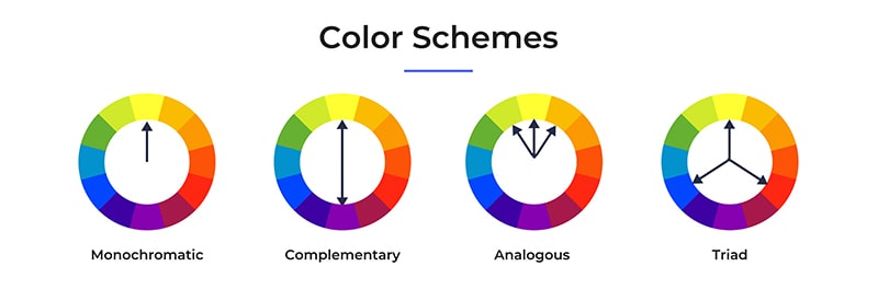
There are formulas to help you pick the right palette and achieve color harmony for your visual art. Let’s quickly go through the main ones that will be especially helpful to beginners. Refer to the color wheel below to get a better sense of what each formula would look like.
- Analogous Colors: These are the colors sitting next to each other on the color wheel. Analogous palettes are inherently harmonious, as they comprise hues similar to each other.
- Complementary Colors: This color combo uses two hues that are exact opposites on the wheel, resulting in a color palette with high contrast.
- Monochromatic Colors: This is a formula based on one primary color and its different shades, tones, and tints. The contrast in monochromatic colors is minimal, but it’s an effortless way to ensure a coordinated look.
- Triad Colors: This color union implements three colors that are evenly separated on the wheel. It creates rich color palettes with significant contrast.
To make your job even easier, you can use online tools like Adobe Color or Pigment to generate pleasant color palettes automatically.
4. Give it Space
Social distancing is just as relevant in graphic design, so make sure to leave space between letters, objects, and sections. The empty area separating design elements is known as white or negative space, although it doesn’t have to be white and is definitely not negative.
White space is essential to give your design room to breathe. It gives the eye a break, helping to draw attention to the right objects. Leaving the right amount of space between elements will allow you to group or separate things and explain how they relate to each other.
Aside from its practical use, negative space can also act as a creative technique to tell a story or pass on a message. Take a look at one of our logo templates which slightly detaches the vertical lines, revealing the shape of a key inside.

5. Don’t Underrate Simplicity
Beginner designers often get out of their way to complicate their works, which can result in a cluttered, messy outcome. When every corner of a graphic is occupied with text or trinkets, the key message gets buried under the details, and the whole design loses its effectiveness.
Never discredit white space; sometimes, it’s exactly what a design needs to look more polished and professional. Decorations are all fun and games until they become too distracting and harm readability. The latter is a priority in graphic design, while decorations are only enhancements. Remember, when in doubt, go for less!
Apple’s trademark minimalist approach to designing its products, website, social media graphics, and everything in between is a classic example of this.
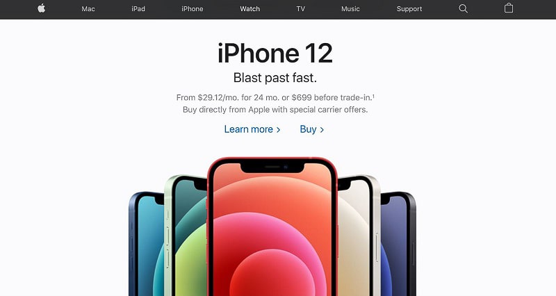
Source: Apple
6. Grid is Your Friend
So, at this point, you’re hopefully convinced of the importance of white space, but how to space objects evenly and create a balanced design? Grid and margin lines will be your rescue here. Almost all graphic design software tools come with grids that you can manually turn on. Be sure to do so and use the lines as your guides.
It’s no surprise that alignment is one of the main design principles, as it’s responsible for giving structure and order to otherwise chaotic layouts.
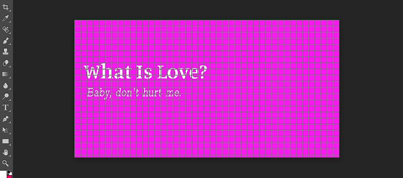
7. Experiment With Scale
In most designs, certain elements receive special emphasis in order to stand out from their counterparts. One of the best ways to achieve this effect is to experiment with scale. Play around with the proportion of your text, icons, images, etc., and see how it transforms your graphic.
Scaling is an excellent trick to highlight an object without having to mix colors or typefaces. Not to mention, it adds a sensation of depth and makes the design more fluid.
The image below has put the scaling technique to great use, enlarging the exact parts of the text that need the audience’s attention.

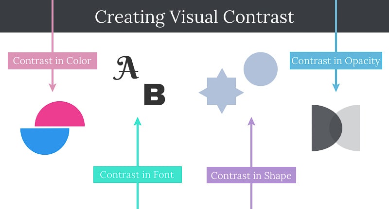
8. Contrast is Non-Negotiable
Contrast is the bread and butter of graphic design. Remove all contrast from an illustration, and you’re left with a monotonous blank canvas. Visual contrast sharpens the image and is incredibly quick in catching the eye. You can choose to have a high or low level of contrast, but you need the latter in order to make a statement.
Contrast can be achieved through colors, fonts, shapes, scale, opacity, alignment, etc. Use contrasting colors or textures to distinguish the background and foreground of an image, create layers, and simulate a 3D environment.
9. Have a Focal Point
We don’t conceive an image as a whole at once: Our eyes are first drawn to particular points that spark the most interest. Taking this into account, it’s critical that you create a visual hierarchy and guide the viewer’s attention across your composition.
What’s the first thing you want the audience to notice in your design? Make it stand out with the use of color, scale, or some other property. As you can see below, the large central text that portrays the business name instantly attracts our gaze, ensuring we don’t miss that piece of information.

10. Set the Theme Beforehand
The importance of having a plan for your design before you start working on it can not be stressed enough. It seems to add another step to the designing process but, in fact, will end up saving time.
Be specific about the message you want to share and choose the right style and setting that align with it. The style of your choice can be professional, sophisticated, or casual, but it’s crucial that you establish it beforehand.
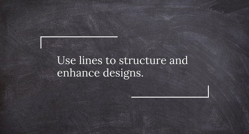
11. Use Lines
An easy and practical way to compartmentalize elements in design is to use lines. Thick or thin, solid or dotted, straight or curved — lines can provide more structure and aesthetic appeal to designs. A simple line can come in handy when separating blocks of text (like header and body), creating text boxes, aligning objects, and more.
12. Consistency Can Take You Far
The themes of your designs will differ from one piece to another, depending on where and how you’re planning to use them. But one thing you need to make sure of is that you have an overall consistent style across all your projects. Whether a user is looking at your website or business card, they need to recognize that it’s yours.
In case you’re a freelancer working with multiple companies, make your designs consistent with the brand identity of the business you’re partnering with.
13. Observe, Observe, Observe
In the beginning stages of learning a new craft, your observation skills are one of the main ones you’ll be relying on. Whether it’s observing art you admire to learn how it’s made or monitoring your brand’s competitors to understand their content strategy, having a sharp eye will surely benefit you.
Before you sit down to work on a project, have a reference point of what you intend to achieve. It’s a great practice to collect your favorite designs in one place to refer to when you need a nudge of inspiration.

14. Constructive Criticism is Your Friend
Getting feedback on your creations is always valuable regardless of your experience level, but it’s especially essential if you’re a beginner. A pair of fresh eyes — or a few pairs — will help you identify possible slips, inconsistencies, or missed opportunities. Stay open to suggestions, adapt, and refine.
15. Stay Creative
If you’ve made it to this point, we’ll let you in on a secret: Even the best of rules only take you so far. To create something that stands out, you have to dare to differ. No rules are unshakable if you have a strong creative vision. Explore, experiment, and express your uniqueness.
That said, it’s best to experiment with the rules only after you’ve taken the time to learn them. You know how the famous saying goes: “Learn the rules like a pro, so you can break them like an artist.” We’re not surprised these words come from Pablo Picasso — a creative genius and inspirational figure for designers around the world.